")
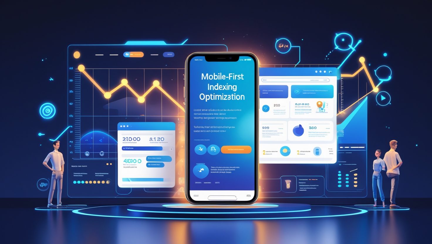
Ultimate Guide to Mobile-First Indexing Optimization 📱📊🚀
With Google’s mobile-first indexing, ensuring your website is fully optimized for mobile users is essential for maintaining and improving your SEO rankings. Since Google primarily uses the mobile version of your site for indexing and ranking, neglecting mobile optimization can lead to decreased visibility and lower search rankings. Follow these key strategies to ensure your website meets Google’s mobile-first requirements.
1. Ensure a Mobile-Friendly Design 📐📱🎨
Google prioritizes websites that offer a seamless experience on mobile devices. Use a responsive design that adapts to different screen sizes and resolutions. Avoid fixed-width layouts and ensure that all elements (text, images, and buttons) adjust properly on smaller screens.
2. Improve Page Load Speed ⚡📶🚀
Mobile users expect fast-loading pages. To enhance speed:
• Optimize images by compressing them without losing quality.
• Minimize the use of large scripts and unnecessary code.
• Enable browser caching and use a Content Delivery Network (CDN).
• Implement Accelerated Mobile Pages (AMP) for lightning-fast page loading.
3. Optimize Content for Mobile Users ✍️📖🔍
Ensure your content is easy to read and navigate on mobile devices by using:
• Short paragraphs and bullet points for better readability.
• Larger fonts to improve text visibility.
• Proper spacing to prevent accidental clicks on buttons and links.
4. Improve Mobile Navigation 🗺️📲🔗
Simplify navigation to enhance user experience:
• Use a clear and concise menu structure.
• Implement a sticky navigation bar for easy access.
• Make call-to-action buttons easily tappable (at least 48×48 pixels).
5. Optimize for Voice Search 🎙️🔊🧐
With the rise of voice search, optimizing for conversational queries is crucial. Use natural language and long-tail keywords that match voice search patterns. Incorporate structured data to help search engines understand your content better.
6. Implement Mobile-Optimized Popups 📢📴🎯
Intrusive popups can negatively impact user experience and SEO. Instead:
• Use exit-intent popups instead of immediate ones.
• Utilize small, unobtrusive banners for promotions.
• Ensure popups are easily dismissible and don’t block essential content.
7. Use Mobile-Friendly URLs 🔗📌✅
Ensure that your mobile and desktop versions have the same URLs to avoid indexing issues. If you use separate URLs for mobile, implement proper rel=canonical and rel=alternate tags.
8. Test Your Site with Google’s Mobile-Friendly Tool 🔍🛠️📊
Google provides a Mobile-Friendly Test Tool that analyzes your website and highlights areas for improvement. Regularly check your site’s performance and fix any mobile usability issues detected by Google Search Console.
9. Optimize Local SEO for Mobile Users 📍📱🗺️
Many mobile searches are location-based. To improve your local SEO:
• Claim and optimize your Google My Business profile.
• Use local keywords in your content.
• Ensure your Name, Address, and Phone Number (NAP) are consistent across all listings.
10. Monitor and Improve Mobile UX Regularly 📊📈🔧
Continuously monitor mobile performance using tools like Google Analytics and Search Console. Track metrics like bounce rate, time on site, and mobile traffic to identify and fix user experience issues.
Conclusion 🚀🎯🏆
Mobile-first indexing is no longer an option—it’s a necessity. By optimizing your website for mobile users, you enhance user experience, improve rankings, and boost organic traffic. Implement these strategies today to stay ahead in the ever-evolving digital landscape!

